


Outdoor Home Painting Colours: Weather-Resistant Exterior Wall Shades Guide
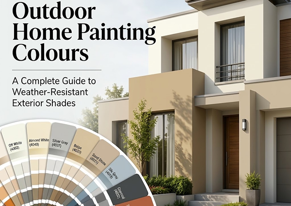
Choosing the right outdoor home painting colours is one of the most important decisions for your home’s exterior look and long-term protection. Exterior walls face sunlight, rain, dust, humidity, heat, pollution and seasonal weather changes. That is why outdoor paint should not only look beautiful, but also stay strong, clean and fresh for a longer time. A good exterior wall colour can improve curb appeal, protect the surface and make your home look modern, elegant and well-maintained. However, choosing the wrong colour may make the exterior look dull, faded or difficult to maintain. This complete guide will help you choose weather-resistant exterior wall shades according to climate, home style, surface condition, sunlight exposure and long-term durability, directly matching the official Reliable Weather Shade Card options. Quick Answer: What Are the Best Outdoor Home Painting Colours? The best outdoor home painting colours are shades that can handle sunlight, dust and changing weather while keeping the home exterior attractive. Popular options from the Reliable Weather Shade Card include: Light Neutrals: Off White (4002), Ash White (4003), Almond White (4040), Silver Grey (4037) Earthy Tones: Beige (4020), Fawn (4025), Sand Stone (4021), Silk Stone (4018) Modern Greys: Sky Grey (4016), Dove Grey (4013), Night Sky (4044), Charcoal (4032) Classic Accents: Terracotta (4009), Brick Stone (4006), Multani Tile (4029), Avocado (4031) Light and neutral colours are usually safer for hot climates because they reflect heat better and fade less noticeably than very dark colours. For long-lasting results, choose weather-resistant exterior paint like Reliable Weather Protector with UV protection, water resistance, anti-fungal properties and good adhesion. Key Factors to Consider Before Choosing Exterior Wall Colours Before finalizing outdoor home painting colours, you should check your home’s location, weather exposure, design style and maintenance needs. 1. Climate and Weather Conditions Exterior walls are directly exposed to sunlight, rain, humidity and dust. In hot and sunny areas, very dark colours may absorb more heat and fade faster. In dusty areas, very bright white may need more cleaning. For hot weather, use: Off White (4002), Ash White (4003), Almond White (4040), Beige (4020), Sand Stone (4021), Silver Grey (4037). For rainy or humid areas, use: Weather-resistant neutral shades with anti-fungal exterior paint properties that hide moisture marks better. For dusty areas, use: Beige (4020), Fawn (4025), Sand Stone (4021), Silk Stone (4018), Hopsack (4023). 2. Sunlight Exposure Sunlight can change how exterior paint looks over time. Strong sunlight can make colours look brighter during the day and may cause low-quality paint to fade. For walls facing direct sunlight, choose UV-resistant exterior paint and avoid extremely dark shades on large wall areas. Best Reliable shades for sunny exteriors: Off White (4002), Almond White (4040), Beige (4020), Sand Stone (4021), Sky Grey (4016), Spice (4028). 3. Home Architecture The colour should match your home’s structure. A modern home may look better with grey, white and charcoal combinations, while a classic house may suit cream, beige, brown and terracotta. For modern homes: Off White (4002) & Sky Grey (4016), Silver Grey (4037) & Charcoal (4032), Night Sky (4044) & White (4001). For traditional homes: Beige (4020) & Terracotta (4009), Sugar Cane (4022) & Spice (4028), Sand Stone (4021) & Brick Stone (4006). For luxury homes: Silver Grey (4037) & Charcoal (4032), Fawn (4025) & Night Sky (4044), New Ash White (4039) & Spice (4028). 4. Roof, Gate and Window Colours Outdoor paint should not be selected separately from the rest of the exterior. Your roof, gate, windows, tiles, boundary wall and front door all affect the final look. For black gates and windows, use: White (4001), Off White (4002), Sky Grey (4016), Silver Grey (4037), Beige (4020). For brown wooden doors, use: Almond White (4040), Beige (4020), Sand Stone (4021), Fawn (4025), Silk Stone (4018). For red or terracotta roofs, use: Off White (4002), Sugar Cane (4022), Autumn Stone (4019), Sand Stone (4021). Outdoor Home Painting Colour Chart (Reliable Shades) Exterior Colour / Shade Exact Reliable Code Best For Weather Benefit Design Look Maintenance Level Off White 4002 Modern and classic homes Reflects heat and looks bright Clean and elegant Medium Beige 4020 Hot and dusty areas Hides dust better than pure white Warm and timeless Low Sky Grey 4016 Modern homes Handles sunlight well with quality paint Sleek and simple Medium Sand Stone 4021 Main walls and boundary walls Ideal for dusty environments Natural and soft Low Fawn 4025 Luxury exterior design Hides stains and dust better Premium and modern Low to medium Terracotta 4009 Traditional homes Warm shade suitable for accents Earthy and bold Medium Avocado 4031 Feature areas and garden homes Blends with natural surroundings Calm and stylish Medium Charcoal 4032 Accent walls, trims and gates Strong visual contrast Modern and bold High (if widespread) Spice 4028 Classic exterior details Hides marks and dust well Strong and grounded Low Silver Grey 4037 Contemporary homes Balanced cool tone Soft and premium Medium Best Outdoor Home Painting Colours for Different Exterior Styles 1. White and Grey for Modern Homes Main walls: Off White (4002) or Silver Grey (4037) Accent: Sky Grey (4016) or Goose Wing (4017) Gate/window: Charcoal (4032) or Night Sky (4044) 2. Beige and Brown for a Warm Classic Look Main walls: Beige (4020) or Sand Stone (4021) Accent: Spice (4028) or Hopsack (4023) Trim: Almond White (4040) or Sugar Cane (4022) 3. Cream and Terracotta for Traditional Homes Main walls: Sugar Cane (4022) or Cameo (4007) Accent: Terracotta (4009) or Multani Tile (4029) Trim: Ash White (4003) or Sand Stone (4021) 4. Fawn and Charcoal for a Premium Exterior Main walls: Fawn (4025) or Silk Stone (4018) Accent: Charcoal (4032) or Night Sky (4044) Trim: Off White (4002) 5. Sand and Green for a Natural Look Main walls: Sand Stone (4021) or Hopsack (4023) Accent: Avocado (4031) or Spring Leaf (4014) Trim: White (4001) or New Ash White (4039) Exterior Colour Combination Chart (Reliable Shades) Main Exterior Colour Accent Colour Best Matched With Overall Look Off White (4002) Charcoal (4032) Black gate and glass windows Modern
How to Choose Paint for Living Room Walls: Colours, Finish and Interior Design Tips
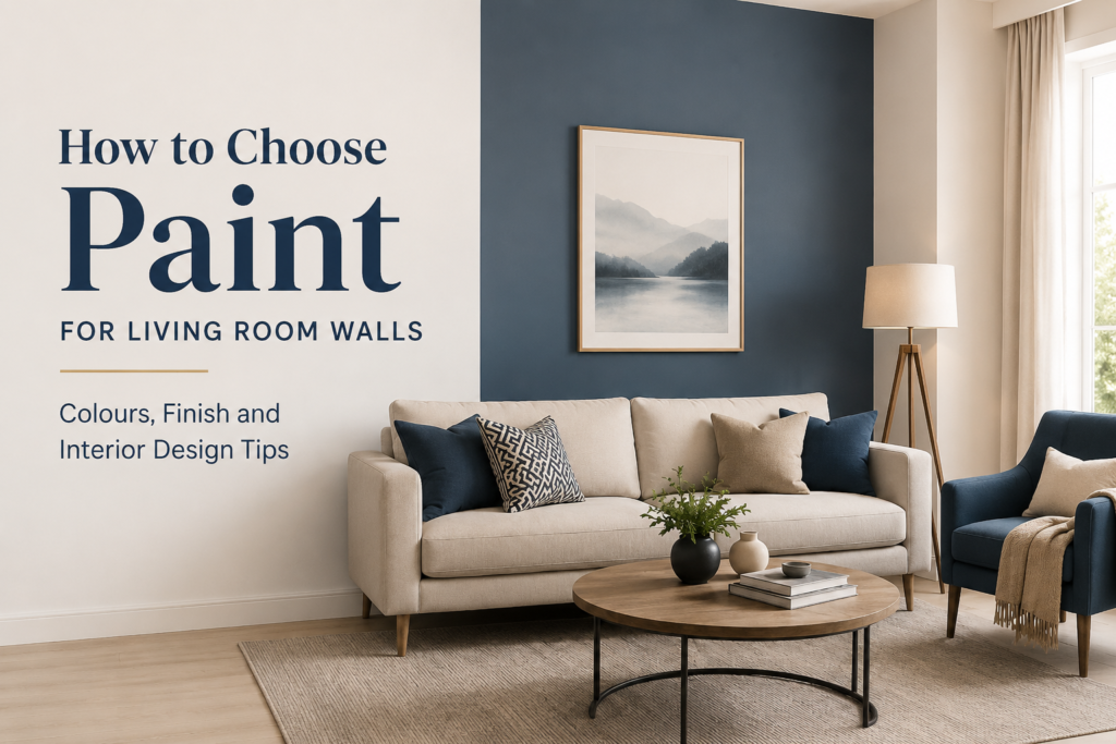
Choosing the right paint for living room walls is one of the most important decisions in home interior design. Your living room is usually the most visible and frequently used area of the house. It is where guests sit, family members relax, conversations happen, and the overall personality of your home becomes visible. A good living room wall paint does more than add colour. It affects brightness, space perception, furniture balance, mood, comfort and the overall interior style. The right colour can make a small living room feel open, a plain space feel elegant, and a modern interior feel warm and welcoming. This guide explains how to choose paint for living room walls by considering colour, finish, lighting, furniture, room size and design style. Quick Answer: What Is the Best Paint for Living Room Walls? The best paint for living room walls depends on your interior theme, lighting and lifestyle. For most homes, neutral colours like off-white, warm beige, greige, light grey and soft taupe work well because they match easily with furniture and décor. For the finish, matt or eggshell is a good choice for a smooth, elegant look, while satin works better in homes that need easier cleaning and better durability. Why Living Room Wall Paint Matters Living room paint plays a major role in creating the first impression of your home. Even expensive furniture and décor can look dull if the wall colour does not support the overall design. The right paint helps you: Wall paint should never be selected only because a colour looks good on a chart. It should be selected according to your room’s size, lighting, furniture colour, floor tone and daily use. Step 1: Understand Your Living Room Size Room size is one of the first things to consider before choosing paint. For Small Living Rooms Small living rooms usually look better with lighter colours. Light shades reflect more light and make the space feel open and airy. Best colours for small living rooms include: Avoid very dark shades on all walls in a small living room because they can make the space feel tighter. However, a dark accent wall can still work if the rest of the room is balanced with light furniture and good lighting. For Large Living Rooms Large living rooms give you more freedom to use deeper and richer shades. You can use warm neutrals, earthy tones, muted greens, navy, charcoal or elegant brown shades depending on your design theme. Best colours for large living rooms include: Large spaces can sometimes feel empty or cold, so warmer colours often help create comfort and depth. Step 2: Check Natural and Artificial Lighting Lighting changes how paint looks on your wall. A colour that looks perfect in a store may look completely different inside your living room. Living Rooms with Good Natural Light If your living room receives plenty of sunlight, you can use both light and medium shades. Natural light makes colours appear clearer and brighter. Good options include: Living Rooms with Low Light If your room has limited natural light, avoid dull or muddy shades. Choose colours that brighten the space. Good options include: In low-light rooms, very cool greys may look flat or gloomy. Warmer undertones usually create a more comfortable feeling. Step 3: Match Paint Colour with Furniture Your wall colour should support your furniture, not compete with it. Before selecting paint, look at your sofa, curtains, rugs, wooden furniture, TV console and flooring. Best Wall Colours for Dark Furniture Dark furniture looks beautiful with lighter walls because it creates contrast. Recommended colours: These colours allow dark brown, black or walnut furniture to stand out without making the room feel heavy. Best Wall Colours for Light Furniture Light furniture gives you more flexibility. You can keep the walls soft and minimal or add a deeper accent shade. Recommended colours: Best Wall Colours for Wooden Furniture Wooden furniture pairs well with warm and earthy shades. Recommended colours: For traditional interiors, warm creams and beige shades work beautifully. For modern interiors, greige and olive can create a premium look. Living Room Paint Colour and Finish Chart Step 4: Choose the Right Paint Finish Paint finish affects the final look, durability and maintenance of your walls. The same colour can look different in matt, satin or gloss finishes. Matt Finish Matt finish gives a smooth, elegant and non-shiny appearance. It is ideal for modern living rooms where you want a soft and premium look. Best for: Matt paint hides wall flaws better than shiny finishes, but it may be slightly harder to clean unless it is a washable matt paint. Eggshell Finish Eggshell has a soft low-sheen appearance. It is more durable than matt and still looks elegant. Best for: Eggshell is one of the safest choices for living room walls because it offers both beauty and practicality. Satin Finish Satin finish has a slightly smoother and more reflective surface. It is easier to clean and works well in homes with children or high activity. Best for: Satin can highlight wall imperfections more than matt, so the wall surface should be properly prepared before painting. Semi-Gloss or Gloss Finish Glossy finishes are usually not recommended for full living room walls because they reflect too much light and can make the wall look uneven. However, they can be used for trims, doors, moulding or decorative details. Step 5: Decide Between Full Room Colour and Accent Wall An accent wall is a great way to add style without making the whole room look too dark or busy. When to Use an Accent Wall Use an accent wall when: Popular accent wall colours include: The best wall for an accent colour is usually the TV wall, sofa-back wall or the wall with decorative panels. Step 6: Consider Your Interior Design Theme Your living room paint should match your overall design theme. Modern Interior For a modern living room, use clean and calm shades. Best colours: Modern interiors usually look best with matt
Best Room Paint Colors for a Modern, Comfortable & Elegant Home
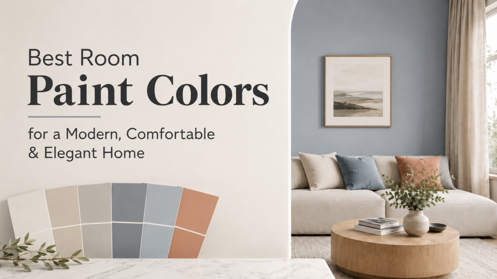
Choosing the right room paint colors can completely transform your home. The right color can make a room feel bigger, brighter, warmer, calmer, and more stylish. It can also improve the overall interior mood and help your furniture, curtains, flooring, and decor look more balanced. Modern homes are no longer only about plain white walls. Today, homeowners prefer paint colors that feel clean, elegant, comfortable, and timeless. Shades like warm white, off-white, cream, beige, greige, light gray, sage green, dusty blue, soft taupe, olive green, charcoal gray, and muted terracotta can create a beautiful interior without making the space feel too loud or outdated. Quick Answer: What Are the Best Room Paint Colors for a Modern Home? The best room paint colors for a modern, comfortable, and elegant home are warm white, off-white, cream, beige, greige, light gray, sage green, dusty blue, soft taupe, olive green, charcoal gray, and muted terracotta. These shades create a calm and premium look while matching easily with furniture, curtains, flooring, and décor. For small rooms, choose light colors such as warm white, off-white, cream, light beige, or light gray. For living rooms, use beige, greige, sage green, or soft taupe. For bedrooms, choose relaxing shades like dusty blue, warm white, sage green, or cream. For a luxury look, add one accent wall in olive green, charcoal gray, or muted terracotta. Why Room Paint Colors Matter Paint color is one of the most important parts of home interior design. It affects how a room looks, feels, and functions. A color that looks beautiful in one room may not work in another because lighting, furniture, room size, and flooring all change the final appearance. The right room paint color can help you: Best Room Paint Colors for a Modern and Elegant Home 1. Warm White Warm white is one of the safest and most elegant paint colors for any room. It gives a clean look without feeling cold or flat. Unlike pure white, warm white has a soft undertone that makes the room feel comfortable and welcoming. Best for: Warm white works well with wooden furniture, beige sofas, black accents, gold décor, and natural flooring. It is also a great choice if you want your home to look bright and spacious. 2. Off-White Off-white is a timeless shade that gives a soft, premium, and balanced look. It is ideal for homeowners who want light-colored walls but do not want a plain white appearance. Best for: Off-white pairs beautifully with both light and dark furniture. It also helps curtains, wall art, rugs, and decorative items stand out naturally. 3. Cream Cream is a warm and comfortable paint color that gives rooms a soft and homely feel. It is more welcoming than white and works especially well in homes with wooden furniture. Best for: Cream walls create a cozy atmosphere and pair well with brown, beige, gold, olive, and wooden tones. 4. Beige Beige is one of the most popular room paint colors for modern and elegant homes. It is neutral, warm, and easy to match with furniture. Best for: Beige creates a calm and balanced background. It works well with white furniture, wooden furniture, dark sofas, marble flooring, and warm lighting. 5. Greige Greige is a mix of gray and beige. It is modern, soft, and very versatile. It gives the elegance of gray with the warmth of beige. Best for: Greige is perfect for homeowners who want a neutral color that does not feel too warm or too cool. It pairs well with black, white, wood, cream, and metallic décor. 6. Light Gray Light gray is a clean and modern paint color that gives rooms a stylish look. It works well in homes with contemporary furniture and simple décor. Best for: Light gray looks beautiful with white furniture, black accents, blue décor, and wooden flooring. In rooms with low light, choose a warm gray instead of a very cool gray. 7. Sage Green Sage green is a soft muted green that feels fresh, calm, and elegant. It is one of the best modern paint colors for homeowners who want a natural and relaxing interior. Best for: Sage green works beautifully with cream, beige, white, wood, rattan, and brass décor. It gives a peaceful look without making the room feel dark. 8. Dusty Blue Dusty blue is a soft, muted blue shade that creates a calm and premium look. It is ideal for bedrooms and relaxing spaces. Best for: Dusty blue pairs well with white, beige, gray, light wood, and cream furniture. It gives a peaceful feeling and works well in both modern and classic interiors. 9. Soft Taupe Soft taupe is a warm neutral shade between brown and gray. It gives a mature, elegant, and cozy look. Best for: Taupe works well with off-white, beige, brown, black, gold, and wooden décor. It is a good choice for homeowners who want a deeper neutral without using very dark colors. 10. Olive Green Olive green is a rich and stylish color that adds depth to a room. It is best used as an accent wall or in rooms with good natural light. Best for: Olive green looks premium with cream furniture, wooden textures, brass accents, beige curtains, and warm lighting. It gives a bold but elegant look. 11. Charcoal Gray Charcoal gray is a strong and modern color. It should be used carefully, especially in small rooms. It works best as an accent wall rather than the main color for all walls. Best for: Charcoal gray pairs well with white, beige, wood, gold, and black furniture. It gives a luxury feel when balanced with lighter colors. 12. Muted Terracotta Muted terracotta is a warm earthy color that adds character and comfort to a room. It is a great choice for homeowners who want something different from regular neutrals. Best for: Terracotta works well with cream, beige, olive green, wooden furniture, and natural fabrics. Best Paint Colors for Living Rooms The living room is usually the main area
Best Paint for Bedroom Walls: Choose the Right Finish for a Relaxing Interior
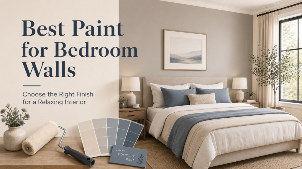
Your bedroom is more than just a place to sleep. It is your personal comfort zone, your peaceful corner, and the space where your day begins and ends. That is why choosing the best paint for bedroom walls is not only about color; it is also about finish, mood, durability, and the overall feel of the room. The right bedroom wall paint can make your space feel calm, fresh, elegant, and more comfortable. Whether you want a soft modern look, a warm cozy interior, or a premium smooth finish, selecting the right paint finish is just as important as choosing the right shade. What Is the Best Paint for Bedroom Walls? The best paint for bedroom walls is usually a smooth matt or premium emulsion paint. These finishes work well because they create a soft, elegant look and help make the room feel more relaxing. For bedrooms, people usually prefer paints that are low-odor, smooth in appearance, easy to maintain, and long-lasting. A bedroom should not feel too glossy or harsh. A soft finish gives the walls a clean and peaceful look, which is ideal for a relaxing interior. Why Paint Finish Matters in Bedrooms Many people focus only on paint color, but the finish plays a major role in the final look of bedroom walls. The paint finish affects how light reflects in the room, how smooth the walls appear, and how easy the surface is to clean. A shiny finish may look attractive in some spaces, but it can reflect too much light in a bedroom. On the other hand, a matt or soft finish creates a balanced and comfortable atmosphere. It also helps hide minor wall imperfections, making the room look neat and refined. Best Paint Finishes for Bedroom Walls 1. Matt Finish Paint Matt finish paint is one of the best choices for bedroom walls. It gives a soft, non-shiny look and creates a calm environment. This type of finish is ideal for people who want a modern and peaceful bedroom interior. Matt paint is also good for hiding small wall imperfections because it does not reflect too much light. If your bedroom walls have slight unevenness, a matt finish can help create a smoother visual appearance. 2. Emulsion Paint Emulsion paint is another popular option for bedroom walls. It is commonly used for interior spaces because it provides a smooth finish and is available in many beautiful colors. A high-quality emulsion paint can give your bedroom a fresh, clean, and premium look. For bedrooms, emulsion paint works well because it is suitable for everyday living spaces and can offer better coverage and durability when applied properly. 3. Soft Sheen Finish A soft sheen finish is a good option if you want a slight glow without making the walls too shiny. It gives the room a refined look and can be easier to clean compared to a completely flat finish. This finish is suitable for bedrooms where you want a slightly modern touch while still keeping the environment calm and comfortable. Best Colors for Bedroom Walls Once you choose the right paint finish, the next step is selecting the right color. Bedroom colors should support relaxation and comfort. Soft, neutral, and soothing shades usually work best. Popular bedroom wall colors include: These colors help make the bedroom feel open, peaceful, and elegant. Light colors are also a great choice for smaller bedrooms because they can make the space look bigger and brighter. Which Paint Color Creates a Relaxing Bedroom? For a relaxing bedroom interior, soft and natural shades are usually the best choice. Colors like cream, beige, pastel blue, sage green, and warm white create a calm and balanced mood. These shades are easy to pair with furniture, curtains, flooring, and lighting. If you want a cozy look, go for warm neutrals like beige, ivory, or light coffee tones. If you want a fresh and airy look, choose soft blue, off-white, or light grey. For a natural and peaceful feel, sage green and muted earthy colors are excellent options. How to Choose the Right Paint for Bedroom Walls Choosing the best paint for bedroom walls depends on a few important factors: Room Size For small bedrooms, lighter colors are usually better because they make the space look bigger and more open. For larger bedrooms, you can use deeper or warmer shades to create a cozy and premium feel. Natural Light If your bedroom gets plenty of natural light, you can choose soft neutrals, light greys, or even slightly deeper tones. If the room has limited light, warm whites, cream, and beige can help brighten the space. Furniture and Interior Style Your wall paint should match your furniture, curtains, bedding, and flooring. For modern interiors, light grey, off-white, and soft beige work beautifully. For classic interiors, cream, warm white, and earthy shades create an elegant look. Maintenance Bedrooms usually do not face as much dirt and moisture as kitchens or bathrooms, but it is still important to choose a paint that is durable and easy to maintain. A high-quality interior paint can keep your bedroom walls looking fresh for a longer time. Matt vs Emulsion Paint: Which Is Better for Bedroom Walls? Both matt and emulsi on paints can be good choices for bedroom walls. The best option depends on the look and performance you want. Matt paint is ideal if you want a smooth, soft, and elegant appearance. It creates a calm mood and hides minor wall flaws. Emulsion paint is a strong interior option that offers good coverage and a fresh finish for bedroom walls. For most bedrooms, a premium matt emulsion paint can be an excellent choice because it combines a beautiful soft look with practical interior performance. Bedroom Paint Ideas for a Premium Interior Look If you want your bedroom to feel more premium, use a simple and elegant color palette. Avoid using too many bold colors on all walls. Instead, choose one main wall color and keep the overall look clean.
Best Paint Combinations to Transform Your Living Space: Room-by-Room Color Ideas for a Stylish Home
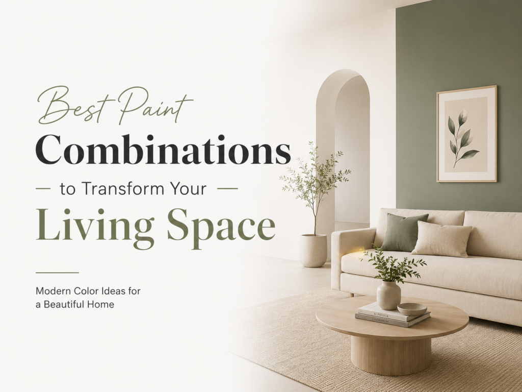
Choosing the right paint combination can completely change the look and feel of your home. A simple living room, bedroom, hallway, or dining area can look more spacious, stylish, cozy, and premium when the wall colors are selected properly. The best paint combinations for a living space usually include a balanced mix of neutral base colors, soft accent shades, and one strong feature color. Popular combinations like warm white and beige, sage green and cream, charcoal grey and off-white, navy blue and soft grey, and greige with warm white can instantly make your home feel more modern, elegant, and welcoming. But the perfect color combination is not only about choosing beautiful shades. It also depends on your room size, natural light, furniture color, flooring, ceiling height, and the mood you want to create. In this guide, we will explore the 20 best paint combinations to transform your living space and help you choose the right colors for a beautiful home interior. Why Paint Combination Matters in a Living Space Paint is one of the most powerful design elements in any home. It affects how your room feels, how spacious it looks, and how your furniture and décor appear. A good paint combination can: Make a small room look bigger Make a dull room feel brighter Create a luxury interior look Highlight your furniture and décor Add warmth, calmness, or energy to the space Improve the overall personality of your home For example, a plain white room may look clean, but it can also feel empty if not paired with the right accent color. On the other hand, a dark color can look premium, but if used incorrectly, it may make the room feel smaller or heavy. That is why the best approach is to create a color balance: use one main color for most walls, one supporting shade for softness, and one accent color for depth. What Is the Best Paint Combination for a Living Room? The best paint combination for a living room is one that feels welcoming, stylish, and comfortable. Since the living room is usually the main area where family members relax and guests are welcomed, the colors should feel balanced and pleasant. Some top living room paint combinations include: Warm White + Beige for a clean and timeless look (e.g., Off White 102 / 203 paired with New Beige 259) Sage Green + Cream for a calm and natural feel (e.g., Soft Green 231 / 544 paired with County Cream 204) Charcoal Grey + Off-White for a bold modern style (e.g., Charcoal 558 paired with New Ash White 262) Navy Blue + Soft Grey for a premium and elegant look (e.g., Mid Blue 217 paired with Soft Grey 215 / 556) Greige + Warm White for a balanced contemporary interior (e.g., Goose Wing 126 / New Ash Grey 260 paired with Ash White 104) If your living room has less natural light, go with lighter combinations. If your room is large and open, you can use deeper accent shades to add character. Top 20 Paint Combinations for Every Living Space 1. Warm White and Beige Paint Combination Shade Pairings: Warm White / Off White (102 / 203) + New Beige (259) / Beige (4020) Best For: Living rooms, bedrooms, dining areas, hallways, and family lounges. Why It Works: Warm white reflects light and makes the room feel open, while beige prevents the space from feeling cold. Works beautifully with wooden furniture, cream sofas, marble flooring, and gold accents. Design Tip: Use warm white on the main walls and beige on one feature wall behind the sofa or TV unit. 2. Sage Green and Cream Paint Combination Shade Pairings: County Cream (204) / Cream + Soft Green (231 / 544) or Lime Frost (123 / 4035) Best For: Living rooms, bedrooms, reading corners, and home offices. Why It Works: Sage green brings a restful organic touch, while cream maintains brightness. Design Tip: Use sage green on an accent wall with plants, rattan textures, and warm white lighting. 3. Charcoal Grey and Off-White Paint Combination Shade Pairings: New Ash White (262 / 355) + Charcoal (558 / 4032) or Smoke Grey (216) Best For: Modern living rooms, TV lounges, and luxury-style interiors. Why It Works: Delivers depth and high contrast without overwhelming the room. Design Tip: Paint only one wall charcoal grey (behind the TV unit or sofa) and keep remaining walls off-white. 4. Navy Blue and Soft Grey Paint Combination Shade Pairings: Soft Grey (215 / 556) + Mid Blue (217) / Regatta Bay (4043) Best For: Formal lounges, master bedrooms, and study areas. Why It Works: Navy blue creates a confident, dramatic focal point, perfectly balanced by calming soft grey. Design Tip: Accentuate with white curtains, silver/metallic décor, and warm ambient lighting. 5. Greige and Warm White Paint Combination Shade Pairings: Ash White (104 / 310) + New Ash Grey (260) / Goose Wing (126) Best For: Apartments, open-plan homes, and modern minimalist interiors. Why It Works: Blends the cozy warmth of beige with the sleek sophistication of grey. Design Tip: Pair with cream sofas, dark accent pieces, and natural light. 6. Cream and Chocolate Brown Paint Combination Shade Pairings: Beige White / Cream (131 / 307) + Chocolate (232) / Dark Brown (212) Best For: Traditional-modern living rooms, dining spaces, and cozy bedrooms. Why It Works: Offers a rich, grounded aesthetic that feels timeless and comforting. Design Tip: Use chocolate brown on feature wall sections or wooden wall panelling. 7. Light Grey and Pure White Paint Combination Shade Pairings: White Ice / Classic White (166 / 562) + Light Grey (255) / Silver Grey (551) Best For: Small apartments, compact living rooms, and minimalist setups. Why It Works: Creates an instantly airy, organized, and luminous atmosphere. Design Tip: Add contrast using dark wooden furniture or matte black light fixtures. 8. Beige and Olive/Avocado Green Paint Combination Shade Pairings: Badami / Fawn (552 / 4025) + Avocado (4031) / Spring Leaf (4014) Best For: Natural,
Complete FAQ Guide to Interior and Exterior Home Paints Including Types, Finishes, Color Trends, Durability, and Maintenance Tips
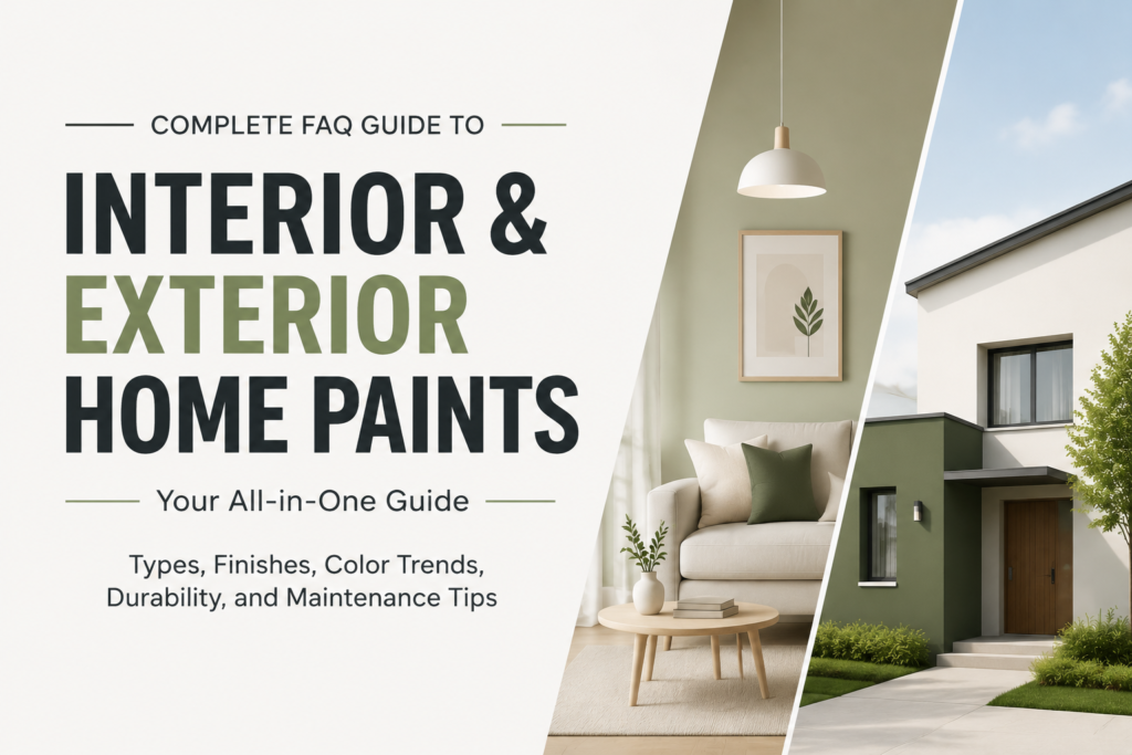
Choosing the right paint for your home is not just about color. It is about durability, protection, style, and long-term maintenance. Whether you are renovating your home or building a new one, understanding interior and exterior paints helps you make smarter and more cost-effective decisions. This FAQ guide answers the most common questions homeowners ask about paints in a simple and practical way. What is the difference between interior and exterior paint? Interior paint is designed for indoor walls. It focuses on smooth finish, easy cleaning, and low odor. Exterior paint is designed for outdoor surfaces. It is built to withstand: In simple terms, interior paint is for beauty inside the home, while exterior paint is for protection outside the home. What are the main types of interior paints? Interior paints come in different types based on finish and usage: 1. Matte Paint 2. Satin Paint 3. Eggshell Paint 4. Gloss Paint What are the types of exterior paints? Exterior paints are more durable and weather-resistant: 1. Acrylic Exterior Paint 2. Elastomeric Paint 3. Cement-Based Paint Which paint finish is best for home walls? It depends on usage: Each finish serves a different purpose, so choosing correctly improves both appearance and durability. What are the latest color trends for homes? Modern paint trends focus on calm, natural, and elegant tones: These colors are popular because they create a clean, modern, and relaxing environment. How long does interior and exterior paint last? Proper surface preparation and quality paint can significantly increase durability. How can you maintain painted walls? Maintenance is simple but important: Good maintenance keeps walls fresh and increases paint life. What factors affect paint durability? Several factors impact how long paint lasts: High-quality paint with proper application always performs better. Are expensive paints worth it? Yes, in most cases. Premium paints offer: While they cost more initially, they reduce repainting frequency, saving money in the long run. Final Thoughts Interior and exterior paints play a major role in the beauty, protection, and value of your home. Understanding paint types, finishes, trends, and maintenance helps you make smarter decisions that improve both aesthetics and durability. Choosing the right paint is not just decoration. It is a long-term investment in your home’s appearance and protection.
Most Popular Wall Paint Designs for Modern Homes 2026
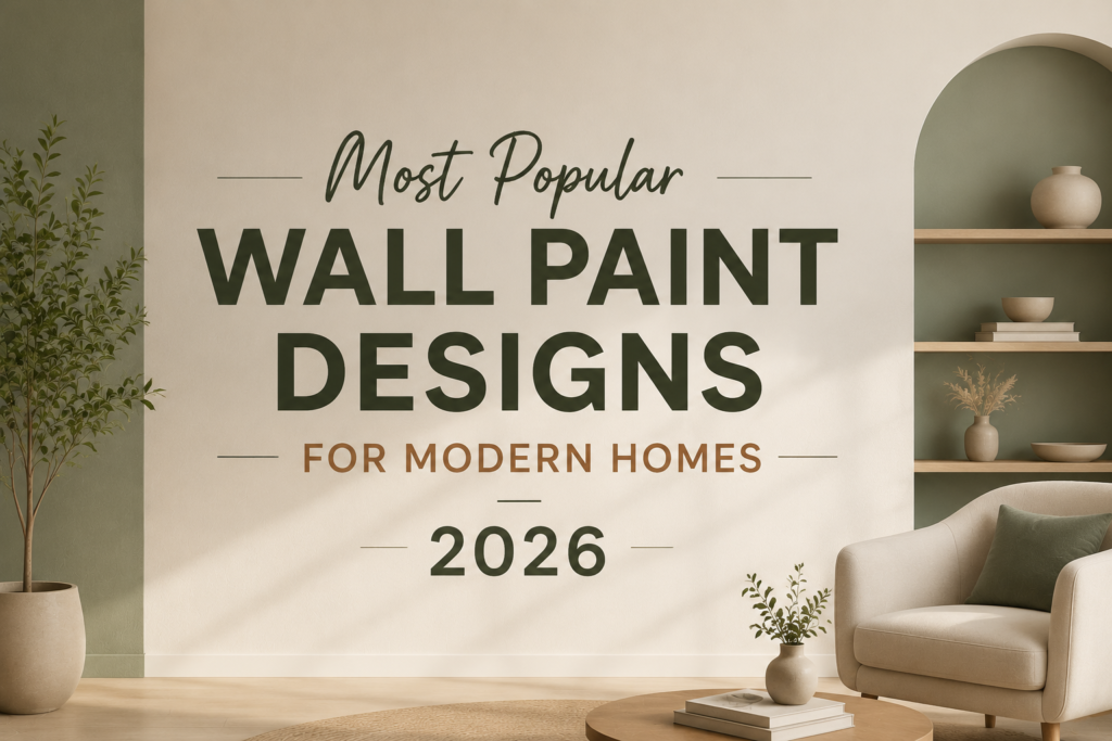
Wall paint design has become one of the most powerful elements in modern interior styling. In 2026, homeowners are no longer sticking to plain single-color walls instead, they are embracing creative textures, artistic patterns, and bold color combinations that completely transform living spaces. From soft gradients to dramatic accent walls, wall paint trends are now about personality, comfort, and visual storytelling. Let’s explore the most popular wall paint designs for modern homes in 2026. 1. Gradient & Ombre Wall Designs One of the biggest trends in 2026 is the rise of gradient layering and ombre walls. Instead of a flat color, walls smoothly transition from light to dark shades of the same hue, creating depth and elegance. This style works especially well in bedrooms and lounges, where a calming atmosphere is desired. Soft blues, earthy browns, and muted greens are top choices for gradient effects. Why it’s trending: 2. Color Drenching (Full Room Painting) Color drenching is a bold modern technique where walls, ceilings, doors, and sometimes even furniture are painted in the same shade. In 2026, designers are using warm neutrals, sage greens, and dusty terracotta tones to create immersive interiors. Why it’s trending: 3. Geometric Wall Paint Patterns Geometric wall designs continue to dominate modern homes. Sharp lines, triangles, arches, and abstract shapes are being used to create feature walls that act as art pieces. This style is especially popular in living rooms, home offices, and creative spaces. Popular color combinations: 4. Textured & Faux Finish Walls Texture is becoming a key design language in 2026 interiors. Instead of flat paint, homeowners are choosing finishes that mimic stone, plaster, cement, or marble. These designs add a natural, organic feel to the home and are widely used in luxury interiors. Why it’s trending: 5. Accent Walls with Bold Colors Accent walls are still one of the easiest and most effective design choices. In 2026, bold tones like deep green, burgundy, navy blue, and burnt orange are dominating feature walls. These walls are usually placed behind sofas, beds, or dining areas to create a focal point. Why it’s trending: 6. Nature-Inspired Earthy Tones Inspired by biophilic design trends, earthy colors are everywhere in 2026 homes. Shades like olive green, sand beige, clay brown, and soft terracotta are becoming modern staples. These tones bring warmth and calmness, making homes feel more connected to nature. Why it’s trending: 7. Abstract Art Wall Painting Modern homes are increasingly using walls as canvases. Abstract brush strokes, artistic splashes, and mural-style painting are replacing traditional wallpapers. This trend is especially popular in luxury apartments and creative studios. Why it’s trending: 8. Two-Tone Wall Designs Two-tone walls are making a strong comeback with a modern twist. Instead of traditional half-wall painting, designers are experimenting with asymmetrical splits and soft blending techniques. Common combinations include: Why it’s trending: Final Thoughts Wall paint design in 2026 is all about creativity, emotion, and personalization. Whether you prefer bold geometric patterns or soft earthy gradients, the goal is to create spaces that reflect your lifestyle and personality. Modern homes are no longer just about furniture they are about walls that speak, inspire, and transform the entire mood of a space. If you’re planning a home makeover, these trending wall paint designs can completely redefine your interiors in a fresh and modern way.
10 Trending Summer Paint Ideas for Homes in Pakistan
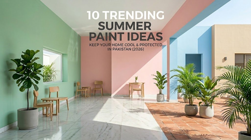
When summer hits Pakistan, the intense heat and blinding sunlight can make our homes feel heavy and cramped. But did you know that the right choice of wall paint can completely change how your home feels? Refreshing your walls with light, airy, and reflective colors doesn’t just make your space look bigger and more modern it actually creates a visually cooler, calmer environment to escape the summer heat. Whether you are renovating your living room or updating your exterior walls to fight off the monsoon and harsh sun, here are the top 10 trending summer paint ideas dominating Pakistani homes this season. Fresh Interior Trends to Cool Down Your Rooms 1. The Classic Off-White & Ash Grey Mix Pure white can feel too sterile under bright afternoon sunlight. Instead, Pakistani homeowners are leaning toward soft off-whites paired with subtle ash grey undertones. This combination reflects maximum light, making small bedrooms feel incredibly spacious and airy. 2. Mint Green & Crisp White Bring the refreshing feel of nature indoors. Mint green is a low-saturation shade that pairs perfectly with white borders and ceilings. It has a psychologically cooling effect, making it an excellent choice for drawing rooms and kitchens. 3. Soft Terracotta Accent Walls If you love warm tones but want to keep the vibe summer-friendly, a soft, muted terracotta is the perfect solution. Instead of painting the whole room, use it on a single accent wall behind your sofa or bed, and balance the rest of the space with cream or warm beige. 4. Cool Coastal Blue Nothing says summer quite like the ocean. Light powder blues or coastal blues bring a calm, serene energy to bedrooms. It works beautifully with dark wood furniture, a common staple in Pakistani households. 5. Creamy Buttermilk Yellow Want to make a dark room feel naturally bright without making it look hot? Soft buttermilk yellow adds a cheerful, sun-kissed warmth without the harshness of bright yellow. It is highly recommended for corridors and dining halls. 6. Sage Green Elegance Sage green has quickly become the ultimate neutral for modern homes. It is earthy, incredibly calming, and pairs beautifully with both indoor plants and minimalist marble floors. 7. Blush Pink & Dove Grey For a chic, contemporary aesthetic, soft blush pink combined with light grey offers a sophisticated look for dynamic living rooms or vanity areas. It is light enough to keep the room cool while adding a distinct personality. Exterior Trends to Boost Curb Appeal and Fight Heat Our exterior walls bear the brunt of Pakistan’s intense summer sun and high humidity. Choosing the right color and product is critical for both style and protection. 8. Sand Beige & Truffle Brown Borders Moving away from boring plain whites, modern homes are using desert sand tones. This palette masks dust incredibly well while looking luxurious under the bright summer sun. 9. Sky Blue & Pristine White Trim Perfect for modern elevations, a light sky-blue exterior paired with clean white architectural trims gives your house a highly premium, Mediterranean villa feel. 10. Minimalist Concrete Grey & Charcoal Accent For fans of modern, industrial, or contemporary architecture, a light concrete grey base paired with stark charcoal structural pillars or gates offers a sleek, high-end finish that stays trendy all year round. Pro Summer Painting Tips for Pakistani Homeowners Never Skip the Undercoat: Summer humidity can cause cheap paints to bubble and peel within months. Always apply a high-quality weatherproof primer before applying your final coats to ensure maximum adhesion. Ready to Transform Your Home This Summer? Picking the perfect summer shade is only half the battle the quality of the paint determines how long that fresh, cool look will last. At Reliable Paints, we offer a premium range of high-performance interior emulsions and ultra-durable Weather Sheets designed specifically to withstand Pakistan’s climate. Our paints offer rich color payoff, excellent coverage, and superior heat-reflection properties to keep your spaces feeling fresh for years to come. Visit your nearest Reliable Paints dealer today for a free color consultation!
Why Cheap Paint Costs More in the Long Run
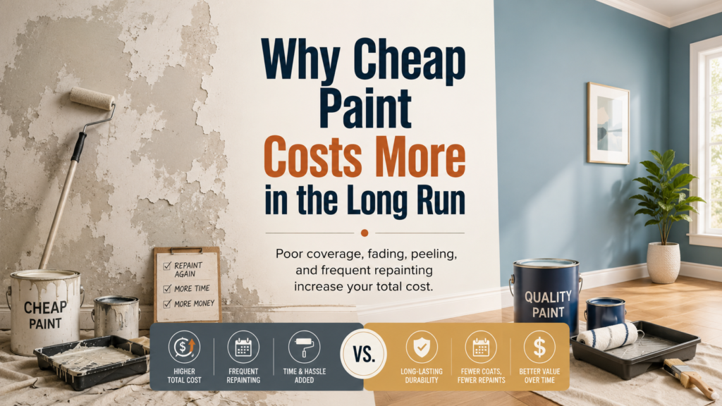
When planning a home painting project, many people try to reduce costs by choosing the cheapest paint available. At first, it may seem like a smart way to save money. However, cheap paint often leads to poor coverage, early fading, peeling, cracking, and frequent repainting. In the long run, low-quality paint can cost much more than a better-quality option. Paint is not just about colour. It protects your walls, improves the look of your home, and helps maintain the surface for years. Choosing the right paint from the beginning can save you time, money, and repair costs. Cheap Paint Usually Has Poor Coverage One of the biggest problems with cheap paint is poor coverage. Low-quality paint often requires more coats to hide the old colour or wall surface properly. This means you may need to buy more paint than expected. For example, a high-quality paint may cover the wall in two coats, while cheap paint may require three or four coats to achieve the same finish. This increases paint quantity, labour time, and overall cost. It Fades Faster Cheap paint usually has weaker pigments, which can fade quickly when exposed to sunlight, dust, and weather changes. This is especially common on exterior walls where paint faces heat, rain, and UV rays every day. Faded walls make your home look old and poorly maintained. As a result, you may need to repaint the surface much sooner than planned. Peeling and Cracking Start Earlier Low-quality paint may not bond properly with the wall surface. When adhesion is weak, paint can start peeling, cracking, or flaking within a short time. This problem becomes worse if the wall is exposed to moisture, humidity, or temperature changes. Once peeling starts, simply applying another coat is not enough. The damaged surface must be scraped, repaired, primed, and repainted, which adds extra cost. More Labour Cost Many people only compare the price of paint, but they forget the labour cost. Cheap paint often takes more time to apply because it needs extra coats, more touch-ups, and more surface correction. Painters may charge more if the paint does not spread well or if the surface needs repeated coating. So even if the paint bucket is cheaper, the total project cost can become higher. Weak Protection Against Moisture Good paint creates a protective layer on the wall. Cheap paint may not offer strong protection against moisture, seepage, fungus, and dampness. In areas with humidity or rain, this can cause serious wall damage over time. Moisture problems can lead to stains, bubbling paint, bad smell, and plaster damage. Repairing these issues is much more expensive than choosing better paint in the first place. Exterior Walls Suffer More Exterior walls need paint that can handle sunlight, rain, dust, pollution, and changing weather. Cheap exterior paint may lose its colour, develop cracks, or peel quickly. A good-quality exterior paint provides better weather resistance and helps protect the surface for a longer time. For homes in Pakistan, where heat, dust, and humidity can be strong, durable exterior paint is a smart investment. The Finish Does Not Look Professional Cheap paint often gives an uneven or dull finish. Brush marks, patchiness, rough texture, and colour inconsistency can make walls look unattractive. Even after spending money on labour, the final result may not look clean or premium. High-quality paint gives a smoother finish, better colour depth, and a more polished appearance. This improves the overall beauty of your home. Frequent Repainting Increases Total Cost The biggest hidden cost of cheap paint is frequent repainting. If cheap paint lasts only a short time, you will have to repaint again sooner. This means buying paint again, paying labour again, and spending time on the same work again. A slightly more expensive paint can last longer and reduce the need for repeated painting. Over time, this makes it more cost-effective. Cheap Paint Can Lower Property Appeal Walls are one of the first things people notice in a home. Faded, peeling, or patchy paint can make your property look neglected. This can affect the impression of visitors, tenants, or potential buyers. Fresh and durable paint improves the appearance of your property and adds value. It shows that the home is well-maintained and protected. How to Make a Smarter Paint Choice Before buying paint, do not focus only on the price. Compare coverage, durability, finish, weather resistance, washability, and protection features. Also check whether the paint is suitable for interior walls, exterior walls, wood, or metal surfaces. Using the right primer and preparing the wall properly is also important. Even high-quality paint will not perform well if the surface is dirty, damp, or uneven. Final Thoughts Cheap paint may look like a money-saving option at first, but it often leads to higher costs in the long run. Poor coverage, fast fading, peeling, moisture damage, extra labour, and frequent repainting can make cheap paint more expensive than expected. Investing in good-quality paint helps protect your walls, improve your home’s appearance, and reduce maintenance costs. For long-lasting results, always choose durable paint, prepare the surface properly, and apply it with the right method.
Eco-friendly Wood And Metal Paints For Furniture : Complete Home Guide
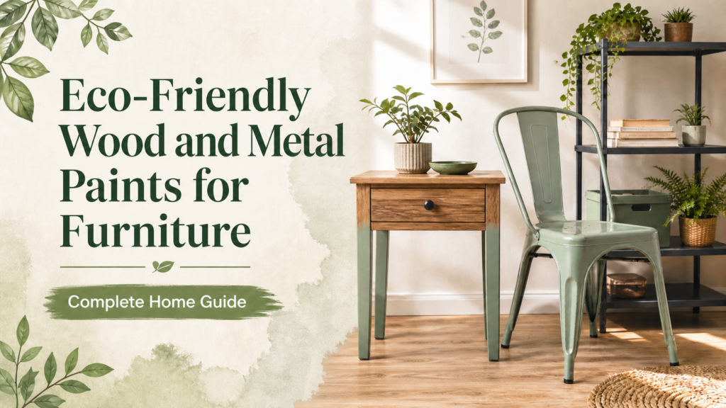
Old furniture does not always need to be replaced. Sometimes, a fresh coat of paint can completely change the look of a chair, table, cabinet, door, grill, or metal frame. The right paint can make furniture look new, match your home décor, and protect the surface from daily wear. Today, many homeowners are also becoming more careful about the type of paint they use inside their homes. Strong smell, harsh finishes, and poor-quality coatings can make furniture painting uncomfortable. This is why eco-friendly wood and metal paints for furniture are becoming a smart choice for modern homes. These paints help refresh furniture beautifully while offering better comfort, lower odour, and practical protection for wood and metal surfaces. Why Furniture Needs the Right Paint Furniture surfaces are different from walls. A wooden chair, metal table, cabinet, door, or grill is touched and used more often. These surfaces need paint that can handle scratches, cleaning, moisture, dust, and daily movement. Using the wrong paint may cause problems like: This is why choosing the correct wood and metal paint is very important. What Makes a Paint Eco-Friendly? Eco-friendly furniture paints are designed to be more comfortable for indoor use and more responsible in their formulation. They usually focus on lower odour, smoother application, and reduced chemical impact compared to traditional options. For homes, this matters because furniture is used in bedrooms, living rooms, kitchens, offices, and children’s areas. A low-odour and good-quality paint makes the painting process easier and helps the furniture return to use more comfortably. Wood Paint vs Metal Paint: What’s the Difference? Wood and metal surfaces behave differently, so they need different paint care. Surface Main Concern What Paint Should Do Wood Moisture, scratches, dullness Protect surface and improve finish Metal Rust, corrosion, heat, scratches Create strong protective coating Furniture Daily use and cleaning Stay durable and smooth Wood can absorb paint, so proper sanding and priming are important. Metal does not absorb paint the same way, so surface cleaning and rust protection matter more. Best Furniture Items to Paint Eco-friendly wood and metal paints can be used on many home furniture items, such as: A simple paint update can give these items a fresh, modern look without buying new furniture. How to Prepare Wooden Furniture Before Painting Good preparation is the secret behind a smooth finish. Before painting wooden furniture, clean the surface properly. Remove dust, oil, and old loose paint. Sand the surface lightly so the paint can grip better. If the wood has holes or cracks, fill them before painting. After sanding, wipe the surface again to remove powder or dust. For better results, use a suitable primer before applying the final coat. This helps the paint look even, last longer, and avoid peeling. How to Prepare Metal Furniture Before Painting Metal furniture needs special care because rust can damage the surface. Before painting, clean the metal properly and remove rust using sandpaper or a wire brush. If the surface is greasy or oily, wipe it with a suitable cleaner. Once the metal is clean and dry, apply a primer made for metal surfaces. This helps improve paint adhesion and protects against rust. After primer, apply the paint in smooth, even coats. Never paint over rust directly. It may look fine for a short time, but the problem can return quickly. Benefits of Eco-Friendly Furniture Paints Eco-friendly wood and metal paints offer several benefits for homeowners. They help reduce strong paint smell, making indoor painting more comfortable. They also provide a smooth and stylish finish that improves the overall look of furniture. Good-quality furniture paint protects surfaces from scratches, stains, moisture, and daily use. For metal furniture, the right paint can also help reduce rust-related damage. For wooden furniture, it can add beauty and surface protection. Most importantly, eco-friendly paint supports a smarter home improvement choice. You can refresh your furniture instead of replacing it, which saves money and reduces waste. Colour Tips for Furniture Painting Furniture colour can change the whole mood of a room. For a modern look, choose white, beige, grey, black, or soft earthy tones. For a bold style, navy blue, forest green, deep brown, or charcoal can make furniture stand out. For small rooms, lighter furniture colours can make the space feel open. For luxury interiors, darker shades can add depth and elegance. Always test the colour on a small area before painting the full furniture piece. Common Mistakes to Avoid Many people start painting furniture without preparing the surface. This is one of the biggest mistakes. Paint needs a clean, dry, and smooth surface to last. Other common mistakes include: A little patience during preparation gives a much better final result. Final Thoughts Eco-friendly wood and metal paints for furniture are a smart way to refresh your home without replacing old items. They help improve the look of furniture, protect surfaces, reduce strong odour, and support better indoor comfort. Whether you are painting a wooden chair, metal table, cabinet, door, grill, or decorative piece, the right paint and proper preparation make all the difference. For homeowners looking for dependable wood and metal paint options, Reliable Paints offers practical solutions for beautiful, durable, and stylish furniture finishes. Refresh your furniture the smarter way with paint that protects, beautifies, and lasts.
Why Primer Should Not Be Skipped Before Painting
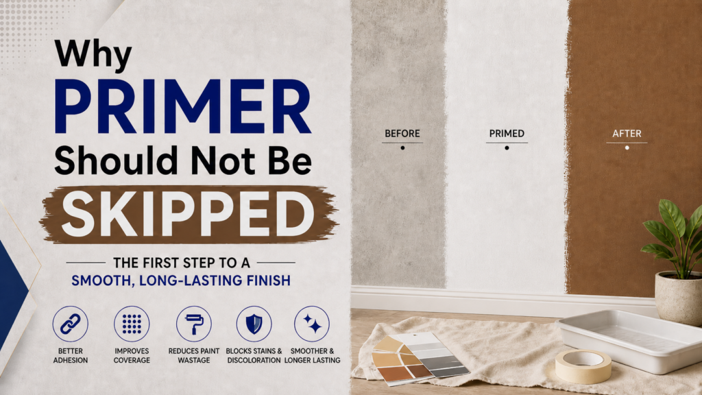
When homeowners plan a painting project, most of the attention goes to colour selection. People spend time choosing the perfect shade for their bedroom, living room, exterior walls, or furniture. But before the final paint goes on the surface, there is one important step that many people ignore: primer. Primer may not look exciting because it is not the final colour, but it plays a very important role in the quality and life of your paint. Skipping primer can lead to patchy walls, poor coverage, peeling paint, uneven colour, and extra paint usage. If you want a smooth, long-lasting, and professional-looking finish, primer should not be treated as an optional step. It is the base that helps your paint perform better. What Is Primer? Primer is a preparatory coating applied before the final paint. Its job is to create a strong and even base for the paint to stick to. It helps the surface become more stable, reduces paint absorption, and improves the final finish. Think of primer as the foundation of a building. If the foundation is weak, the final structure will not be strong. In the same way, if the wall or surface is not properly prepared with primer, the paint may not last as expected. Why Primer Is Important Before Painting 1. Primer Improves Paint Adhesion Paint needs a clean and suitable surface to stick properly. Some surfaces are too smooth, too porous, dusty, or uneven. Primer helps create a better grip between the surface and the paint. Without primer, paint may not bond properly. This can result in peeling, flaking, or cracking after some time. 2. Primer Helps Cover Old Colours If you are changing from a dark colour to a light colour, primer is very helpful. For example, painting white or beige over dark blue, red, green, or brown can be difficult without primer. The old colour may show through the new paint, making the wall look uneven. Primer helps block the old colour and creates a neutral base, so the new shade appears cleaner and more accurate. 3. Primer Reduces Paint Wastage Many people skip primer thinking they are saving money, but it can do the opposite. Without primer, walls may absorb more paint, especially if the surface is new, rough, or porous. This means you may need extra coats to get proper coverage. Primer helps reduce absorption and allows the final paint to spread more evenly. As a result, you can get better coverage with less paint. 4. Primer Gives a Smooth and Even Finish Walls often have repaired patches, filled cracks, stains, or areas with different textures. If paint is applied directly, these uneven areas may remain visible. Primer helps balance the surface. It creates a more uniform base, which improves the smoothness and appearance of the final coat. This is especially important for living rooms, bedrooms, offices, and feature walls where the finish needs to look neat and polished. 5. Primer Helps Prevent Stains from Showing Some walls have stains caused by moisture, smoke, grease, markers, old paint, or water damage. If these stains are not treated properly, they may appear again through the new paint. Primer helps block stains and reduces the chances of discoloration. However, if the stain is due to dampness or leakage, the main problem should be fixed first before applying primer or paint. Where Primer Should Be Used Primer is useful in many painting situations. You should consider primer when painting: Each surface may need a different type of primer, so choosing the right one matters. Primer for Interior Walls Interior walls need primer when the surface is new, repaired, stained, or uneven. Primer helps interior paint look smoother and more consistent. For bedrooms, lounges, drawing rooms, hallways, and offices, using primer can improve the final appearance and make the paint last longer. Primer for Exterior Walls Exterior walls face sunlight, rain, dust, humidity, and temperature changes. These conditions can weaken paint if the surface is not prepared properly. Primer helps exterior paint stick better and improves durability. It also helps protect the wall surface and supports better performance of weather-resistant paints. For exterior painting, primer is especially important on new cement surfaces, repaired areas, and walls that previously had peeling paint. Primer for Wood and Metal Surfaces Wood and metal surfaces need primer for different reasons. Wood can absorb paint unevenly, which may cause patchy finishing. Primer helps seal the wood and creates a smoother base. Metal surfaces need primer to improve adhesion and help protect against rust. For gates, grills, railings, furniture, and metal doors, primer is a key step before applying final paint. Skipping primer on wood or metal can reduce the life of the paint finish. Common Mistakes People Make with Primer Many painting problems happen because primer is used incorrectly or skipped completely. Common mistakes include: Primer works best when the surface is clean, dry, and properly prepared. Can You Paint Without Primer? In some cases, primer may not be necessary. If the wall is already painted, clean, smooth, and you are repainting with a similar colour, you may not always need primer. However, primer is strongly recommended when the surface is new, damaged, stained, porous, repaired, or when you are changing colours. When in doubt, using primer is usually the safer choice for a better and longer-lasting finish. Final Thoughts Primer should not be skipped because it directly affects the quality, durability, and appearance of your paint. It improves adhesion, reduces paint wastage, covers old colours, blocks stains, and creates a smooth base for the final coat. A beautiful paint finish does not start with the topcoat. It starts with proper surface preparation and the right primer. Reliable Paints offers paint solutions for interior, exterior, wood, and metal surfaces to help homeowners achieve smooth, durable, and long-lasting results.
How to Avoid Paint Wastage During Home Painting
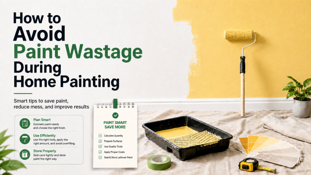
Home painting can make your space look fresh, clean, and beautiful. But one common problem many homeowners face is paint wastage. Sometimes people buy more paint than needed, apply too much paint on the wall, mix paint incorrectly, or leave unused paint open for too long. Paint wastage does not only increase your cost; it also creates extra mess and makes the painting project less efficient. The good news is that with proper planning and careful application, you can reduce paint wastage and get better results. This guide will help you understand simple and practical ways to save paint during home painting. 1. Calculate Paint Quantity Before Buying The first step to avoiding paint wastage is calculating how much paint you actually need. Many people guess the quantity and end up buying too much or too little. Before buying paint, measure the wall height and width. Multiply height by width to get the wall area. If there are doors or windows, subtract their area from the total measurement. Also consider how many coats you need. Most walls usually require two coats for a smooth finish. If the wall is dark, rough, or newly plastered, it may need primer or extra coverage. A proper estimate helps you buy the right quantity and avoid unnecessary leftover paint. 2. Check Wall Condition Before Painting Wall condition has a big impact on paint usage. A rough, dusty, cracked, or damp wall absorbs more paint and gives uneven coverage. This means you may need extra paint to cover the surface properly. Before painting, inspect the wall carefully. Clean dust, remove loose paint, repair cracks, and fix dampness issues. A smooth and clean wall needs less paint and gives a better finish. Good wall preparation saves both paint and time. 3. Use Primer Where Needed Primer helps paint stick better and improves coverage. Many homeowners skip primer to save money, but this can actually increase paint usage. New plastered walls, repaired patches, stained areas, and dark-coloured walls usually need primer. Without primer, the wall may absorb more paint, and the final colour may look patchy. Using primer creates an even base, so the paint spreads better and fewer coats may be needed. 4. Choose the Right Paint for the Surface Using the wrong paint can lead to poor coverage and more wastage. Interior walls need interior paint, exterior walls need weather-resistant exterior paint, and wood or metal surfaces need specific wood and metal coatings. If you use paint that is not suitable for the surface, it may peel, fade, or require more coats. Choosing the correct paint type from the start helps reduce waste and improves durability. 5. Mix Paint Properly Paint should be mixed properly before application. If the paint is not mixed well, the colour and texture may look uneven. This can result in repainting, which wastes more paint. Stir the paint thoroughly before use. If thinning is required, follow the recommended amount. Adding too much water or thinner can weaken the paint and affect coverage. Always mix only the amount you need for the current area instead of opening and mixing all paint at once. 6. Use the Right Tools The tools you use also affect paint wastage. A poor-quality brush or roller may absorb too much paint, create uneven strokes, or cause dripping. For large walls, a roller is usually better because it spreads paint evenly and covers more area quickly. Brushes are useful for corners, edges, trims, and small sections. Using quality tools helps control paint application and reduces dripping, splashing, and overuse. 7. Apply Thin and Even Coats Applying thick paint coats does not mean better coverage. In fact, thick coats can cause drips, uneven drying, cracks, and wastage. It is better to apply thin and even coats. Let the first coat dry properly before applying the second coat. This gives a smoother finish and avoids unnecessary repainting. Controlled application helps you use paint efficiently. 8. Do Not Leave Paint Open Paint can dry or become thick if the container is left open for too long. This makes it harder to use later and may lead to wastage. Always close the paint lid tightly after use. If you are taking a short break, cover the container properly. Keep paint away from direct sunlight, heat, and dust. Proper storage helps preserve leftover paint for touch-ups or future use. 9. Paint in the Right Weather Weather can affect paint performance, especially for exterior walls. Painting during rain, high humidity, or extreme heat can cause poor drying and weak coverage. When paint does not dry properly, the surface may need repainting, which increases wastage. Choose dry and suitable weather for painting. For indoor painting, make sure the room has proper ventilation. 10. Save Leftover Paint for Touch-Ups If some paint is left after the project, do not throw it away. Store it properly for future touch-ups. Small scratches, stains, or marks can be fixed later using the same paint colour. Label the container with the room name and colour shade so you can easily identify it later. This helps reduce waste and keeps your walls looking fresh for longer. Final Thoughts Avoiding paint wastage during home painting is all about planning, preparation, and proper application. Measure your walls, prepare the surface, use primer where needed, choose the right paint, and apply thin, even coats. Small steps can save paint, reduce cost, and improve the final finish. A well-planned painting project gives better results with less waste. Reliable Paints offers quality paint solutions for interior, exterior, wood, and metal surfaces to help homeowners achieve smooth, beautiful, and long-lasting results.